Comdirect
directed by vvand
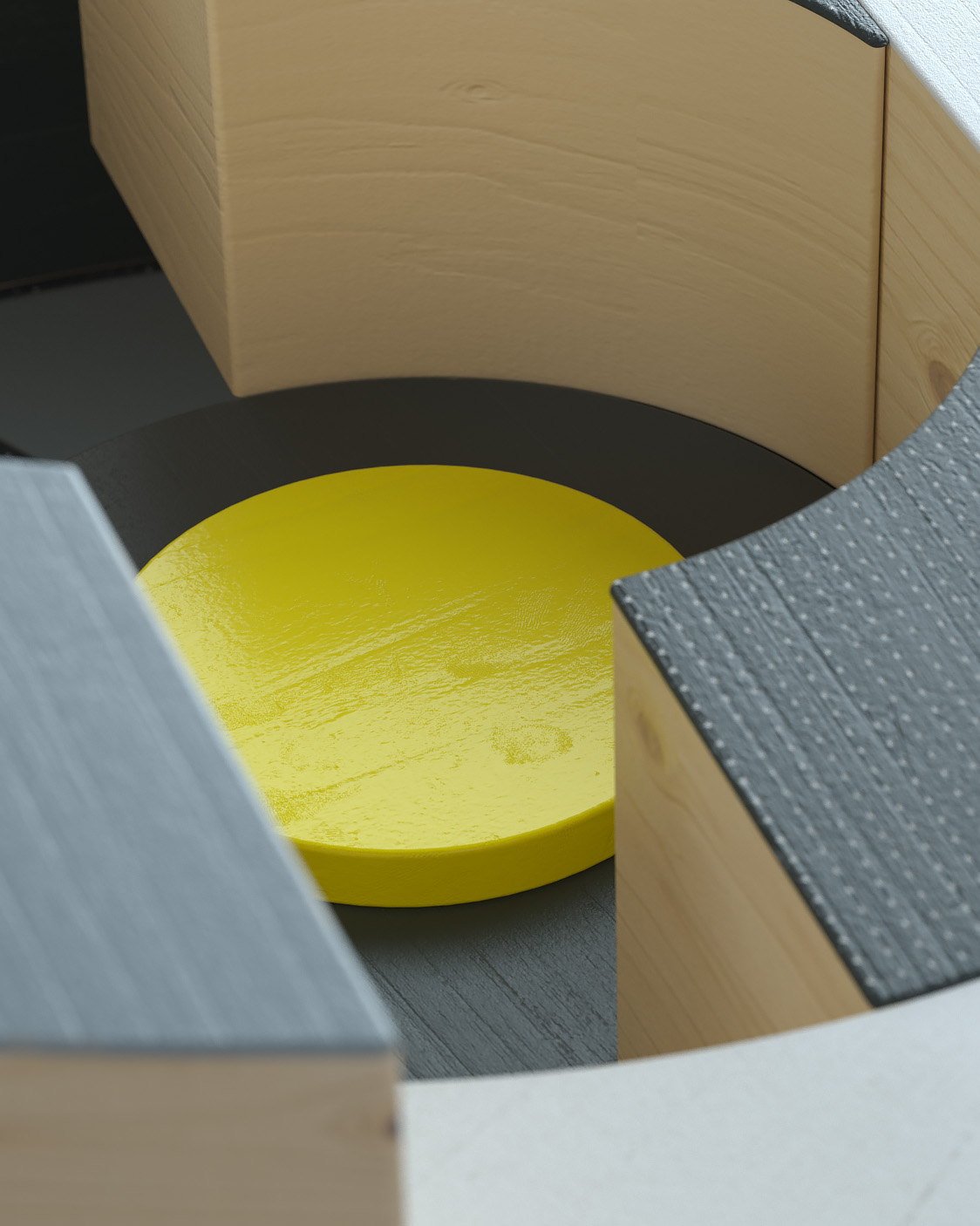
Our idea was to create a bunch of action-reaction based animations. They were metaphors for different ways dealing with money. During the process we managed to connect everything together and we were able to finish a film with a yellow coin being the main hero.


Ideas — Concept
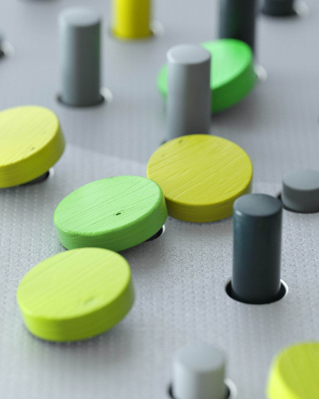
The colour palette is based on the new CI of Comdirect, predominantly anthracite and grayscale. Yellow acts as the highlight colour with a gradient to green drawing the viewer’s attention to the stories’ heroes. The environment is based on dots, points and circles inspired by visual language used in the world of stock markets.
CREDITS